Thursday, October 30, 2025
Problem
Climate change is abstract and overwhelming. Wildfire data spanning decades is difficult to comprehend. How might we visualize 40 years of wildfire activity in a way that's both accurate and emotionally impactful?
Role
Information Designer (Academic Project) Data Visualization, Editorial Design, Typography
Tools
Adobe Illustrator, Adobe InDesign, Adobe Photoshop, and Python (data processing)
Outcome
Created editorial spreads, transforming complex environmental data into an accessible narrative
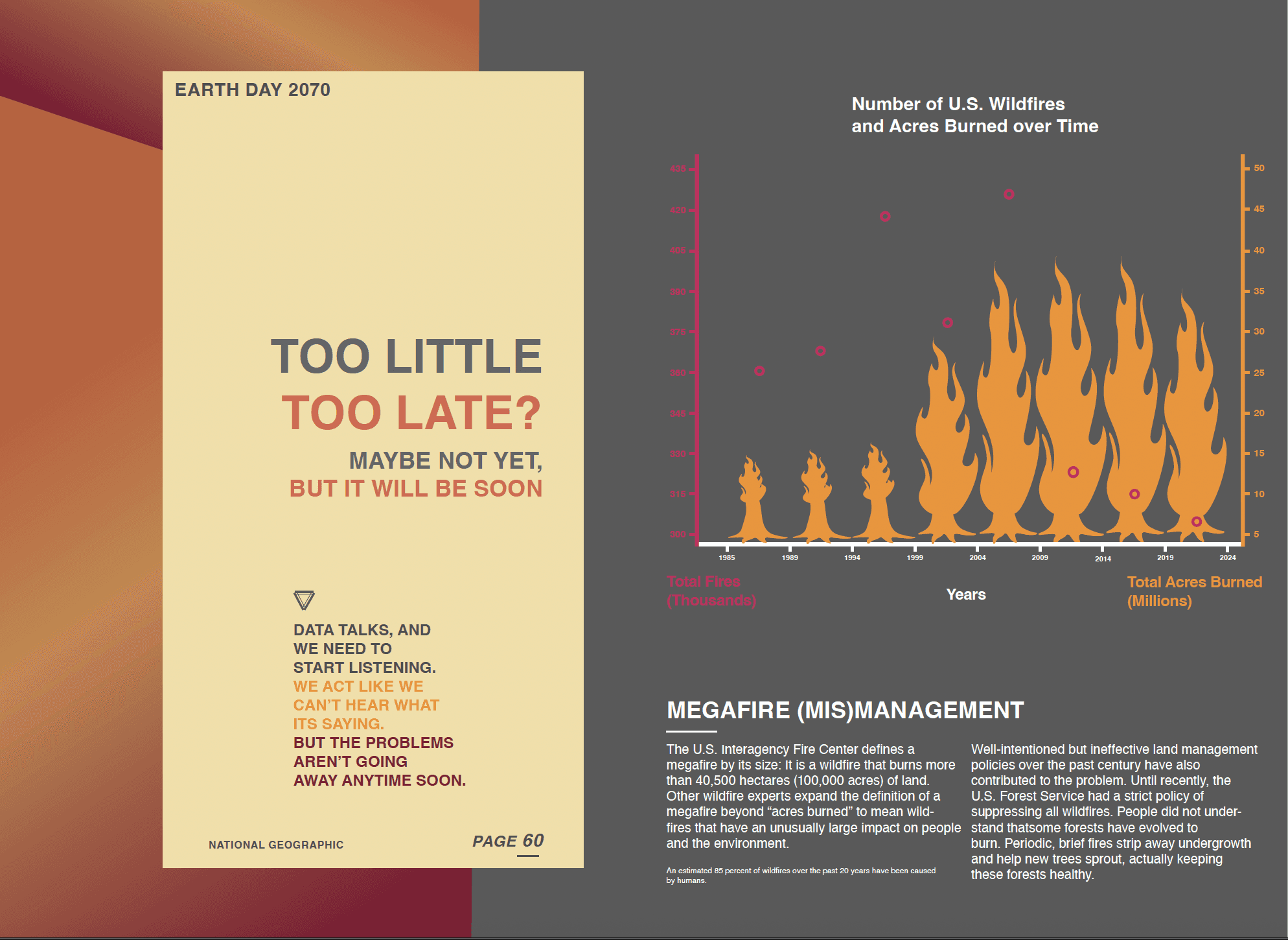
Understanding the Story in the Numbers: The Data
Source: National Interagency Fire Center, NOAA Climate Data
Timespan: 1983-2023 (40 years)
Variables: Acres burned, number of fires, cost (inflation-adjusted), severity of fires
Geographic scope: United States (focus on Western states)
Key Findings
Accelerating Devestation
• 1980s average: 2.3M acres/year
• 2020s average: 7.1M acres/year
• 3× increase despite improved firefighting technologyRising Costs
• $1.2B (1985) → $3.2B (2023) in 2023 dollars
• Exponential growth, not linearLonger Fire Seasons
• 1970s: 5 months average
• 2020s: 7.5 months average
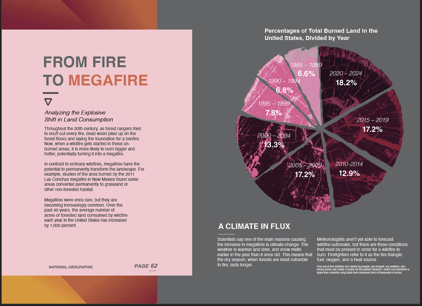
• Fires now year-round in some regionsMegafires
• Fires over 100,000 acres were rare (2-3/year in the 1980s)
• Now common (8-12/year in 2020s)
• "Megafire" becomes new normal
The Challenge
How do you make these numbers FEEL real? How do you communicate urgency without overwhelming readers into paralysis?
Making Data Feel Human: Design Principles
Principle 1: Use Fire as a Visual Metaphor
Don't just show numbers—use visual language of fire (heat colors, organic forms, ascending patterns) to make data visceral.
Principle 2: Progressive Complexity
Lead with the most shocking stat, then layer in context. Let readers absorb information in stages.
Principle 3: Contrast Creates Clarity
Use stark color contrast (cool blues/grays vs. hot oranges/reds) to separate "before" from "after," "normal" from "crisis."
Principle 4: Typography as Data
Let type size, weight, and placement reinforce the data story. Big numbers should feel BIG.
Editorial Context
This spread was designed for a hypothetical climate awareness publication targeting educated general audience (similar to Wired, National Geographic, Scientific American).
The goal: make complex environmental data accessible without dumbing down.
Page Setup
Magazine spread: 17" × 11" (bleed included)
Columns: 6-column grid (flexible for different visualizations)
Margins: 0.5" (generous for print)
Gutter: 0.25" asymmetrical layout
Left page: Text-heavy (context, explanation)
Right page: Visual-heavy (charts, graphs)
This creates tension—the left page sets up the problem, the right page hits you with the scale of it.
What I Learned
Data has Emotion
Numbers aren't neutral. The way you visualize data shapes how people feel about it. Using fire metaphors made abstract statistics urgent and real.Restraint can be Powerful
I removed more than I added in the final revisions. Every chart, every label, every color needed to earn its place. Less was more effective.Print Forces Discipline
Unlike digital work, where you can scroll endlessly, a magazine spread has fixed dimensions. This constraint forced me to prioritize what truly mattered.
Challenges
Balancing Accuracy & Impact
How do you make data dramatic without being manipulative? I was careful to use appropriate scales, show complete time series, and cite sources clearly.Avoiding Despair
Climate data is depressing. How do you communicate urgency without making readers feel helpless? I included a solutions sidebar (not shown in portfolio) suggesting actionable steps.Technical Precision
Every data point needed to be accurate. I triple-checked calculations, cross-referenced sources, and had a statistician review my work.
Next Steps
With more time/scope, I would:
Animate the visualizations for digital presentation
Include interactive elements (hover for details)
Expand to a multi-page feature with deeper analysis
Add personal stories from communities affected by fires
Design a companion infographic for social media sharing
Category:
Print Data Visualization
Client:
Theoretical National Geographic Article
Duration:
3 Weeks
Location:
St. Louis