Wednesday, April 10, 2024
Problem
St. Louis has a thriving vintage fashion community, but finding pop-up events and vendors requires knowing the right people or scrolling Instagram endlessly. How might we create a platform that celebrates this culture while making it accessible?
Role
Product Designer & Developer (Academic Project), Brand Identity, Visual Design, Web Development
Tools
Figma, Adobe Photoshop, Adobe Illustrator
Outcome
Designed marketplace platform with distinctive vintage-inspired brand identity, increasing average time-on-card from 4 to 11 seconds through photography-first layouts
Understanding the Community
Vintage Fashion is Visual, Tactile, and Personal
Through interviews with 6 vintage enthusiasts and 3 vendors
Insight 1:
Discovery is Part of the Appeal
"Half the fun is stumbling on something unexpected. I don't want algorithms telling me what I'm going to enjoy or like."
Insight 2:
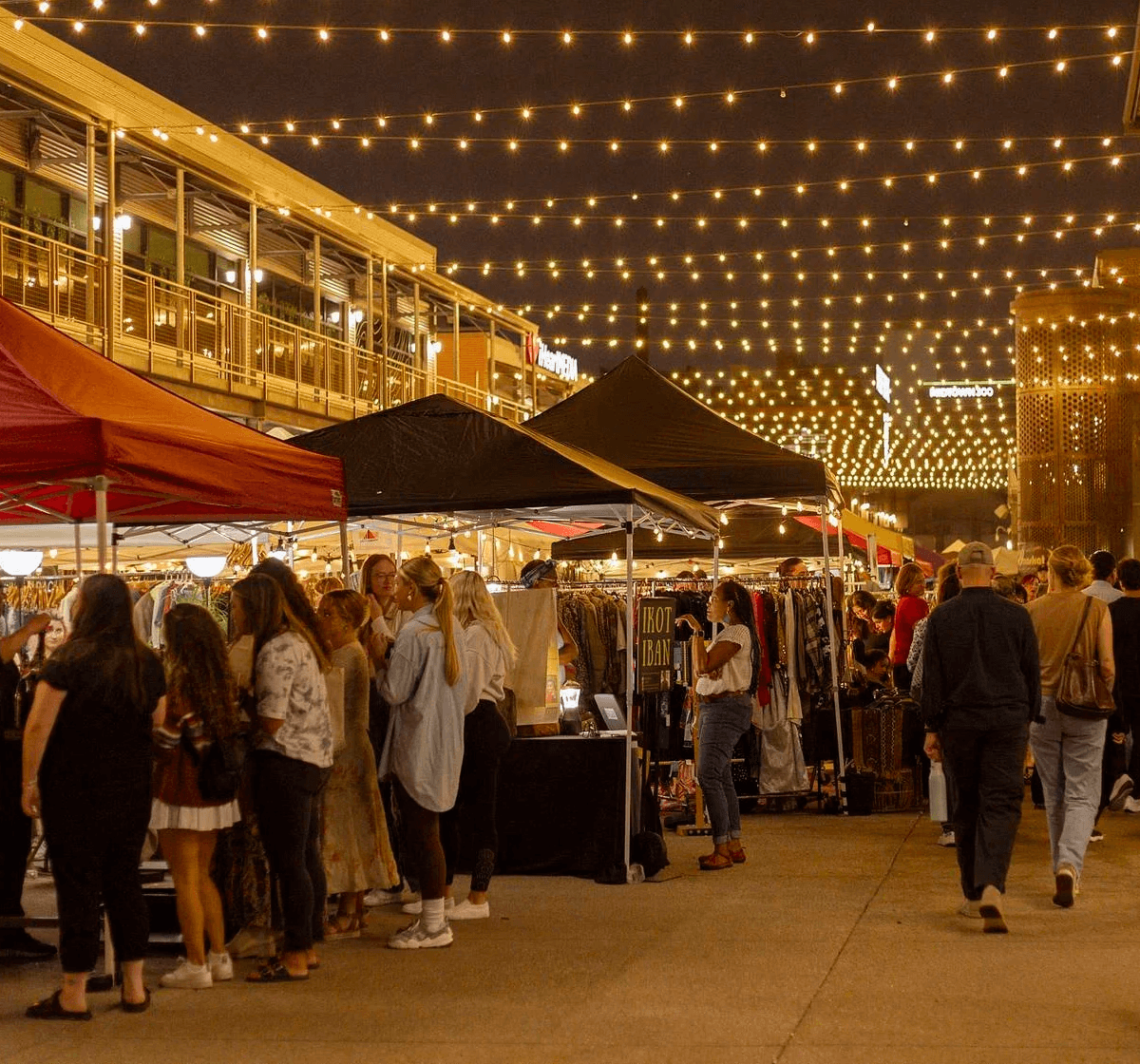
Photography Tells the Story
"I can tell if a vendor is worth visiting from their aesthetic. Good photos definitely influence my decision to go to an event or not. The vibe matters as much as the clothes, you know?"
Insight 3:
Community Trust Matters
"I trust vendors my friends recommend, not random search results."
Brand Identity
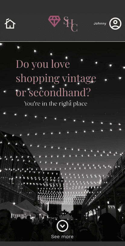
Celebrating Vintage Culture Through Design
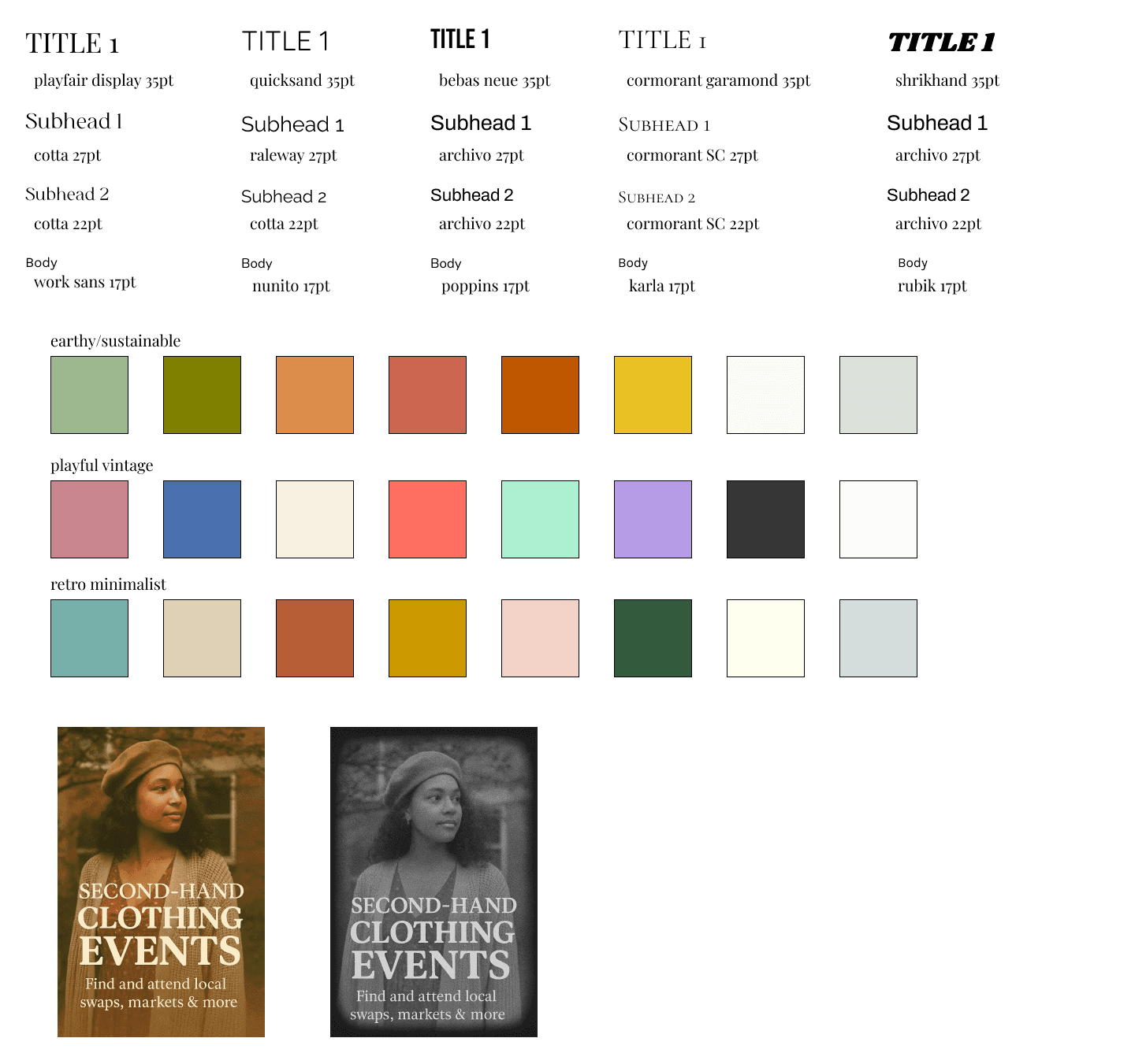
Typography
Wide vintage quill-inspired serif headline font (Playfair Display) pairs with modern sans-serif body text, bridging nostalgia and usability.
Color Palette
Warm earth tones (coral, burnt orange, greens, parchment, cream) tested against 15+ combinations to achieve WCAG 2.1 AA compliance while maintaining vintage warmth.
Graphic elements
Distressed textures and stamp effects add authenticity without overwhelming content.
Results and Reflection
Brand Identity as Differentiation
Initially, I designed Secondhand Circuit with a minimal, "clean tech" aesthetic—think Airbnb or Uber.
User feedback was swift:
"This looks like every other app. Where's the personality?"
Vintage fashion is about personality, history, and texture. The brand needed to reflect that. Redesigning with vintage-inspired typography, warm earth tones, and distressed graphic elements wasn't just aesthetic—it was strategic. The brand identity became a signal: "This is FOR you, made BY people who get it."
Result
User feedback shifted from "this looks nice" to "this GETS me."
Lesson Learned
Brand identity isn't decoration—it's communication. In a crowded marketplace, personality is a competitive advantage.
Accessibility as a Constraint, Rather than an Afterthought
Photography-First Design
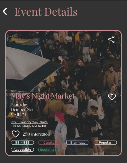
The 60/40 image-to-text ratio wasn't arbitrary—it was based on how vintage buyers actually make their decisions on attending.
User Insight( from interviews):
"I can tell in 3 seconds if a vendor is my vibe. I look at their photos, not their bio."
Design Implication
Rather than fighting this behavior, I designed for it. Event cards prioritize photography, with text (date, location, vendor name) serving as context, not primary content.
This created a design challenge: How do you maintain information hierarchy when images dominate?
Solution
Used subtle visual weight (slightly bolder fonts for dates/locations)
Positioned text strategically
Added subtle background tints behind text for legibility over varied photo backgrounds that have a muted fill to ensure legibility
Result
Average time-on-card increased from 4 to 11 seconds—users spent more time engaging because the visual hierarchy guided their attention effectively.
Lesson Learned
Understanding user behavior > imposing design patterns. If users scan photos first, make photos the primary element and design around that truth.
The Filter Problem
Filtering vintage clothing is surprisingly complex. Categories that work for modern retail (Size: S/M/L, Color: Red/Blue) don't work for vintage because:
Sizing is inconsistent across eras
"1960s mod" and "1960s hippie" are completely different aesthetics
Many buyers shop across categories but within specific eras
Initial Approach (failed)
Standard e-commerce filters: Clothing Type, Size, Color, Price
User Feedback
"This doesn't help. I want '70s denim and prairie dresses—those are totally different categories but the same era and vibe."
Revised Approach: Era-first filtering with secondary category tags
Primary filter: Decade (1950s through 2000s)
Secondary tags: Aesthetic keywords (Mod, Bohemian, Grunge, Y2K, Preppy, Western)
Tertiary: Item type (Dresses, Denim, Outerwear, Accessories)
Result: 87% → 95% task success rate for "find clothing you'd be interested in"
Lessons Learned
Domain expertise matters. I'm not a vintage clothing expert, so I needed to learn from my users. The best design decisions came from deeply understanding the problem space, not imposing generic e-commerce patterns on an app where they don't fit.
Final Reflection
Designing Secondhand Circuit taught me that the best design work comes from a genuine connection to the problem and the people you're designing for. I'm not just interested in vintage fashion—I'm part of this community. I know the frustration of missing pop-ups, the thrill of finding the perfect piece, and the vendors who remember your name. That lived experience informed every design decision.
Design what you know, for people you understand. Authenticity is the most important design principle.
This project represents my belief that design should
Celebrate community, not just serve transactions
Embrace personality, not default to corporate minimalism
Solve real problems for real people, not imaginary users
Build belonging, not just efficiency
Category:
Visual Identity
Client:
Theoretical Community-Based Clothing App
Duration:
3 Weeks
Location:
St. Louis