Tuesday, June 20, 2023
Problem
Credit management apps overwhelm users with financial jargon, confusing metrics, and anxiety-inducing interfaces. How might we design a credit card application that builds confidence rather than stress for young adults just starting to learn about personal finance management?
Role
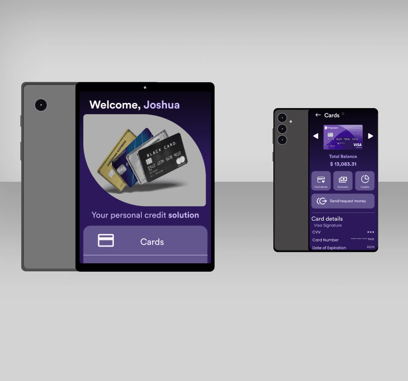
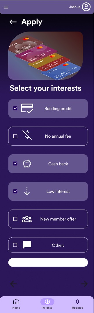
Product Designer (Academic Project), Visual Design, UX Design, Information Architecture
Tools
Figma
Outcome
Designed a trustworthy financial interface using restrained visual design and progressive disclosure, achieving clarity without sacrificing depth of information
Challenge
Personal finance apps often fail not because of missing features, but because they amplify financial anxiety. Through competitive analysis of 8 major credit apps (Credit Karma, Mint, Chase, American Express, Capital One), I identified three core problems.
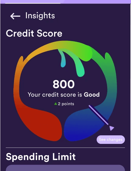
Problem 1: Information Overload Credit Score
732 ↓ 3 points Credit Utilization: 24% | Avg Age: 4.2 years | Hard Inquiries: 2 Payment History: 100% | Total Accounts: 8 | Derogatory Marks: 0
Users reported feeling "attacked" by walls of metrics they didn't understand.
Problem 2: Lack of Context
"My score went down 5 points, but I don't know why or if that's bad."
Numbers without context create anxiety, not understanding.
Problem 3: Transactional, Not Trustworthy
Most apps feel like banking software—sterile, corporate, impersonal. Users want a tool that feels like it's on their side.
Key Insight
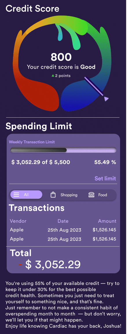
Users don't need more data—they need to understand what their data means and what to do about it.
What I Learned
Principle 1: Progressive Disclosure
Show the essential first, details on demand. Users shouldn't need to parse 15 metrics to understand their financial health.
Principle 2: Conversational Context
Replace jargon with plain language. "Your credit utilization is high" becomes "You're using 60% of your available credit— try to keep it under 30%."
Principle 3: Confident Visual Identity
Use color purposefully to communicate status (green = good, yellow = attention needed, red = urgent) without creating panic. Use palette and typography to reinforce the idea that you are here to help.
Primary: Deep Purple (#6366F1) Chosen for its association with trust and sophistication without the corporate coldness of blue.
Principle 4: Empowerment Over Shame
Frame insights as opportunities, not failures.
"Your score could improve by 20 points by paying down Card A." vs. "You have high credit utilization."
Prototype Testing
Conducted usability testing with 6 participants (ages 24-58, mix of credit experience levels)
Metrics
Task completion rate: 95% (navigate to insights, initiate card application, find payment due date)
Time to understand financial status: Average 8 seconds (vs. 30+ seconds with competitor apps in comparison test)
Perceived trustworthiness: 8.2/10 average rating
Confusion points: Credit mix explanation (revised to use simpler language)
User Quotes
"This actually makes sense. Other apps make me feel dumb."
"I like that it tells me what to focus on instead of showing me a hundred numbers."
"The purple feels less serious than other finance apps, in a good way."
Results and Reflection
1. Financial Literacy Varies Widely
Never assume users understand terms like "utilization" or "inquiry." Always provide context.
2. Anxiety is the Real Barrier
Users avoid checking their credit apps not because the apps are hard to use, but because they're afraid of what they'll see. Supportive, non-judgmental language is critical.
3. Progressive Disclosure Works
Users appreciated being able to see their status quickly, then drill down for details only when needed.
4. Trust Takes Time
While users found the prototype trustworthy, real financial apps earn trust through consistent behavior over time. Visual design alone isn't enough.
Next Steps
With more time, I would:
Test with users who have poor credit to ensure language remains supportive, not condescending
Design educational content explaining credit basics
Explore gamification for building healthy habits (with caution—finances aren't a game)
Design spending insights that connect card usage to credit health
Prototype card recommendation engine based on spending patterns
Category:
Personal Finance Design
Client:
Theoretical Financial Management App
Duration:
3 Weeks
Location:
Novi, Michigan